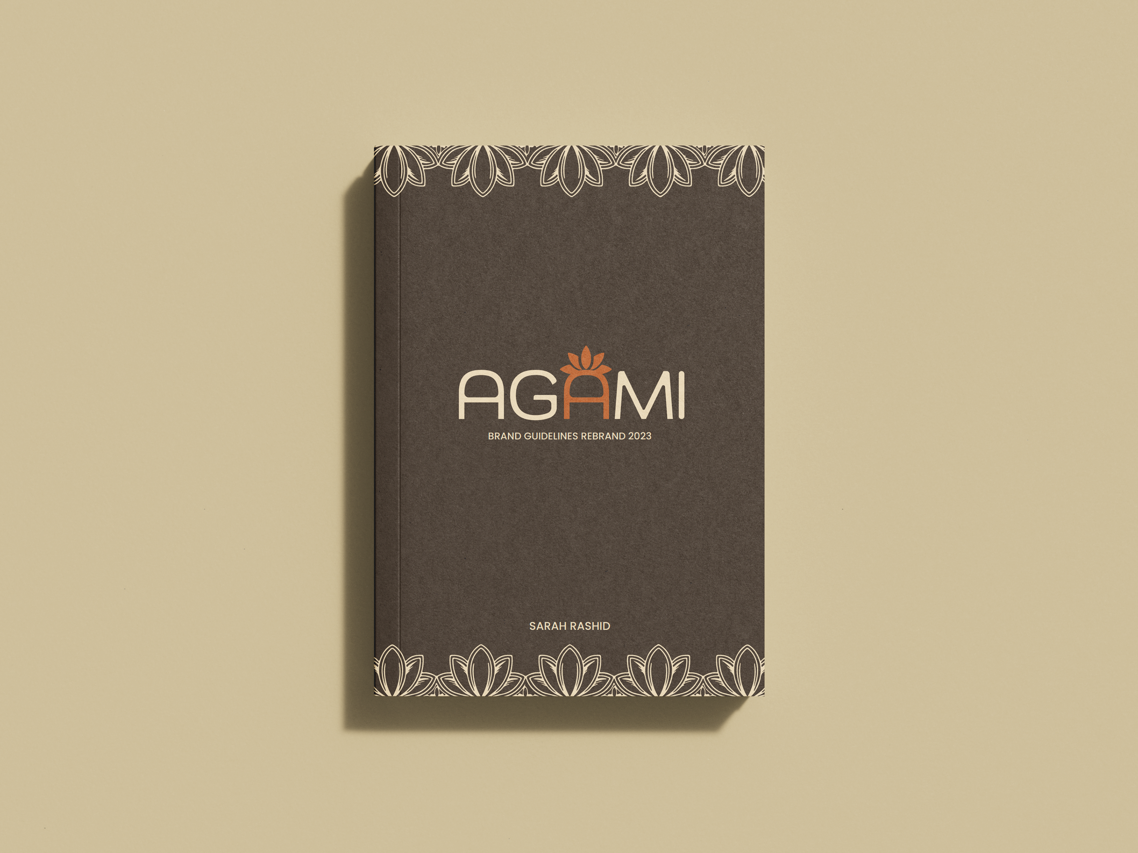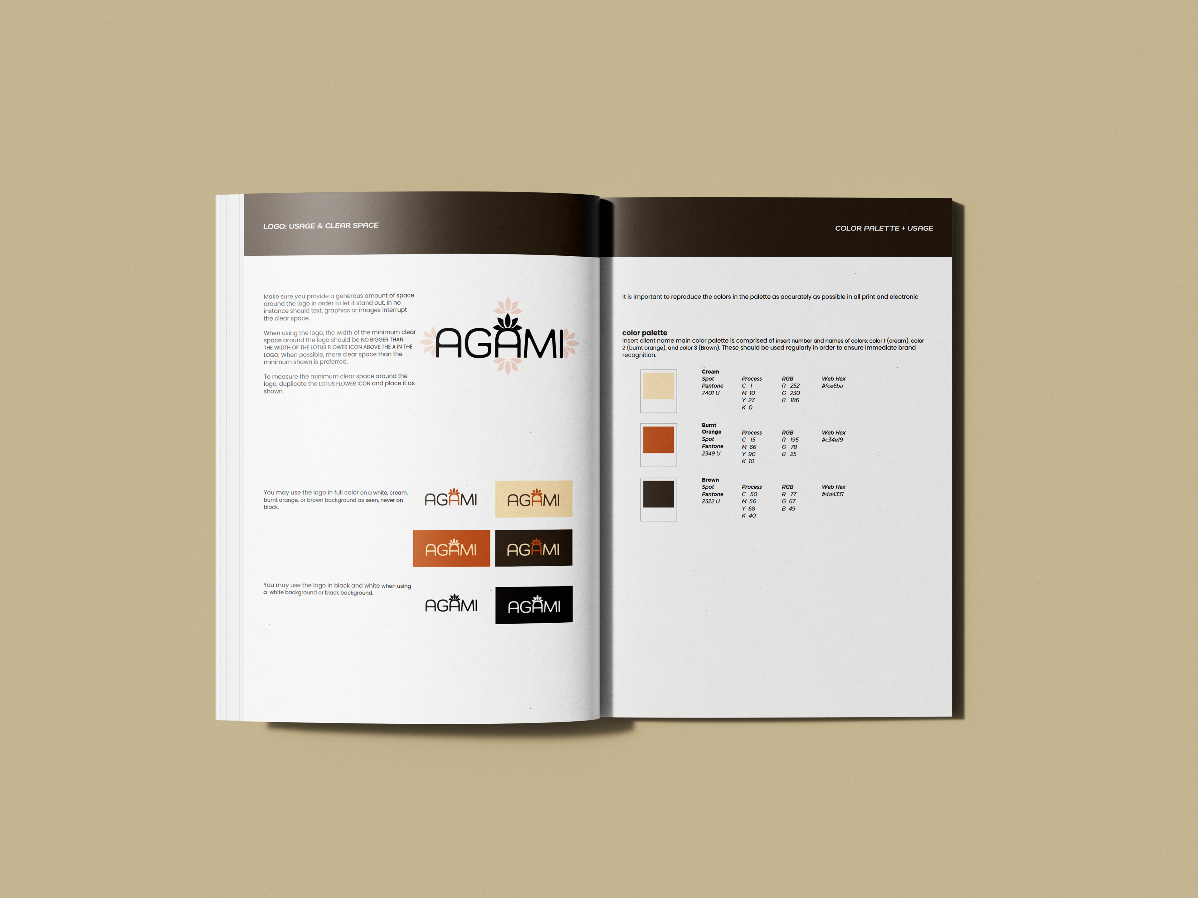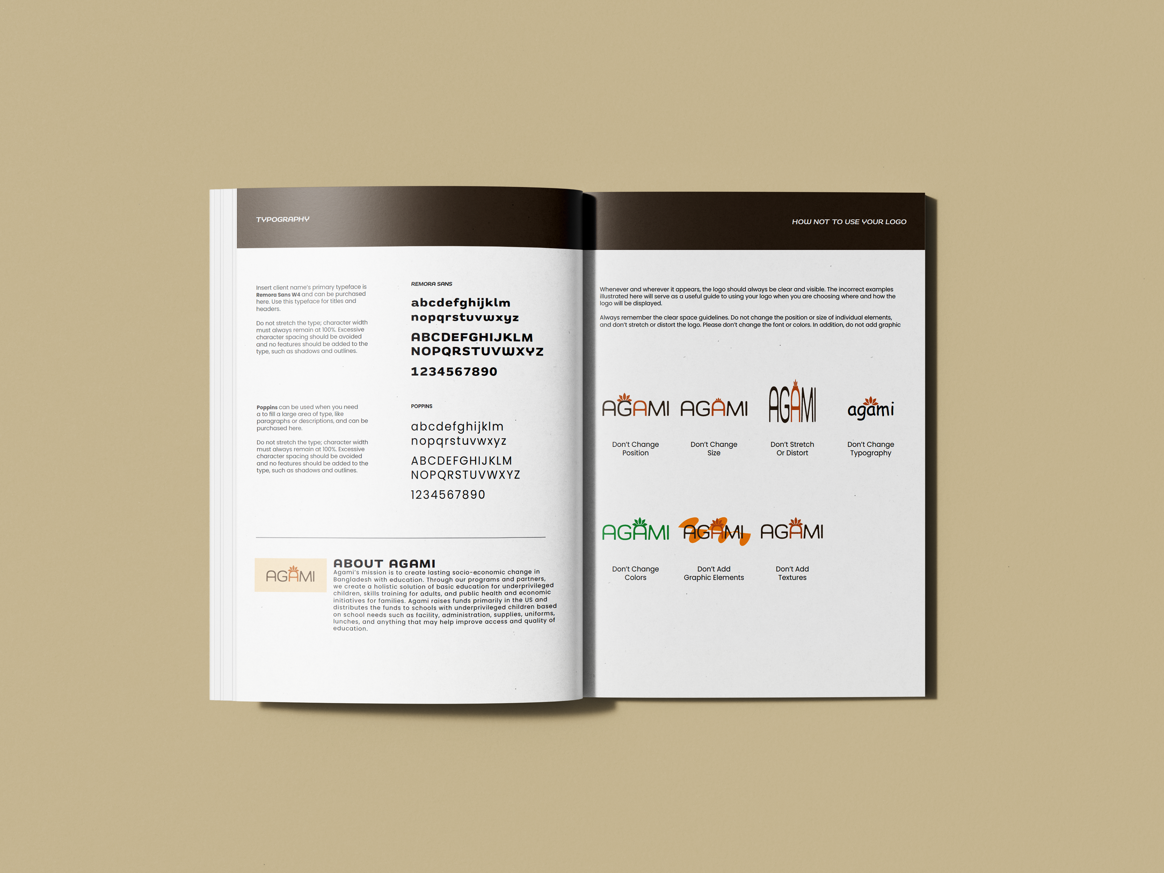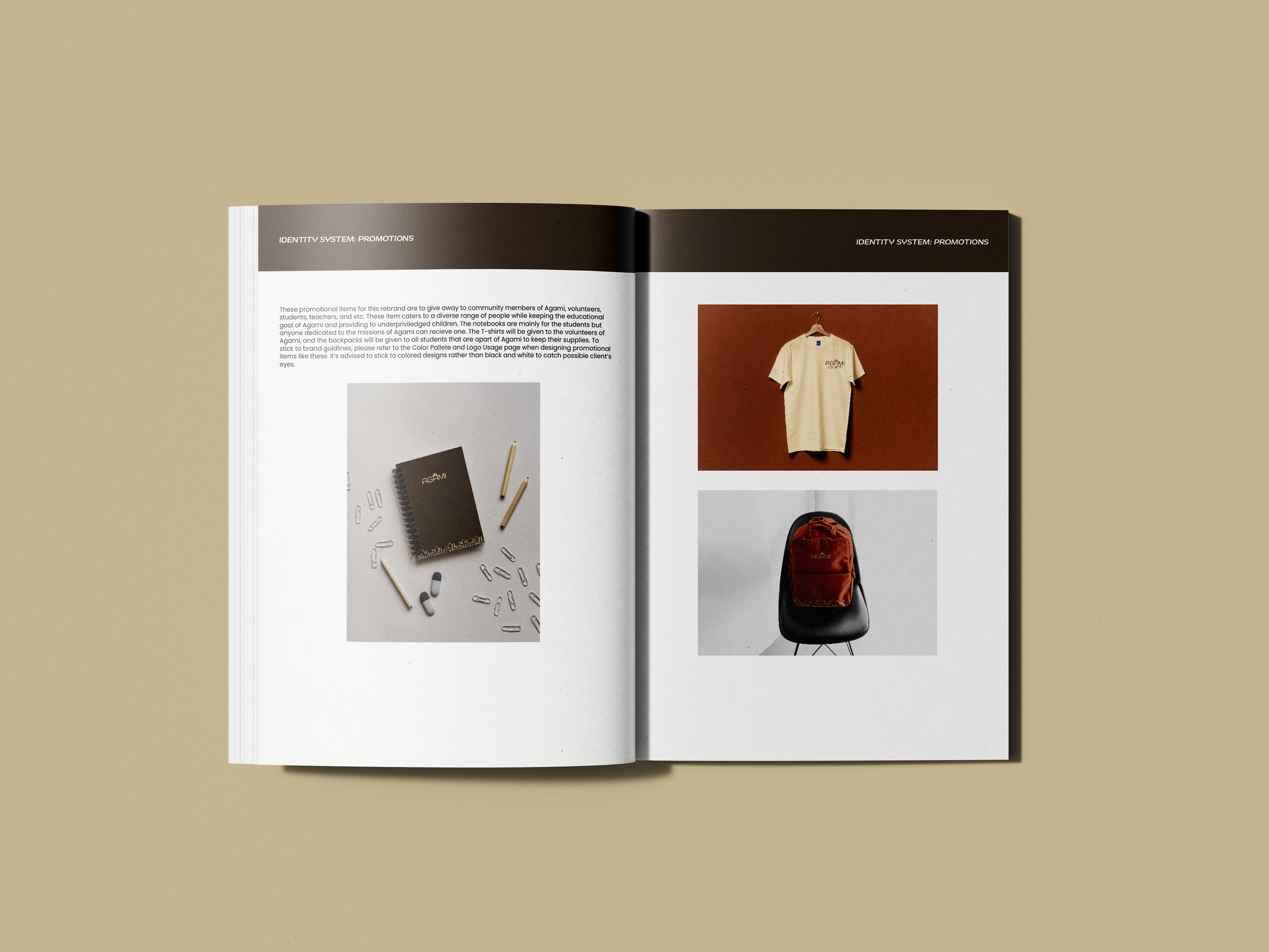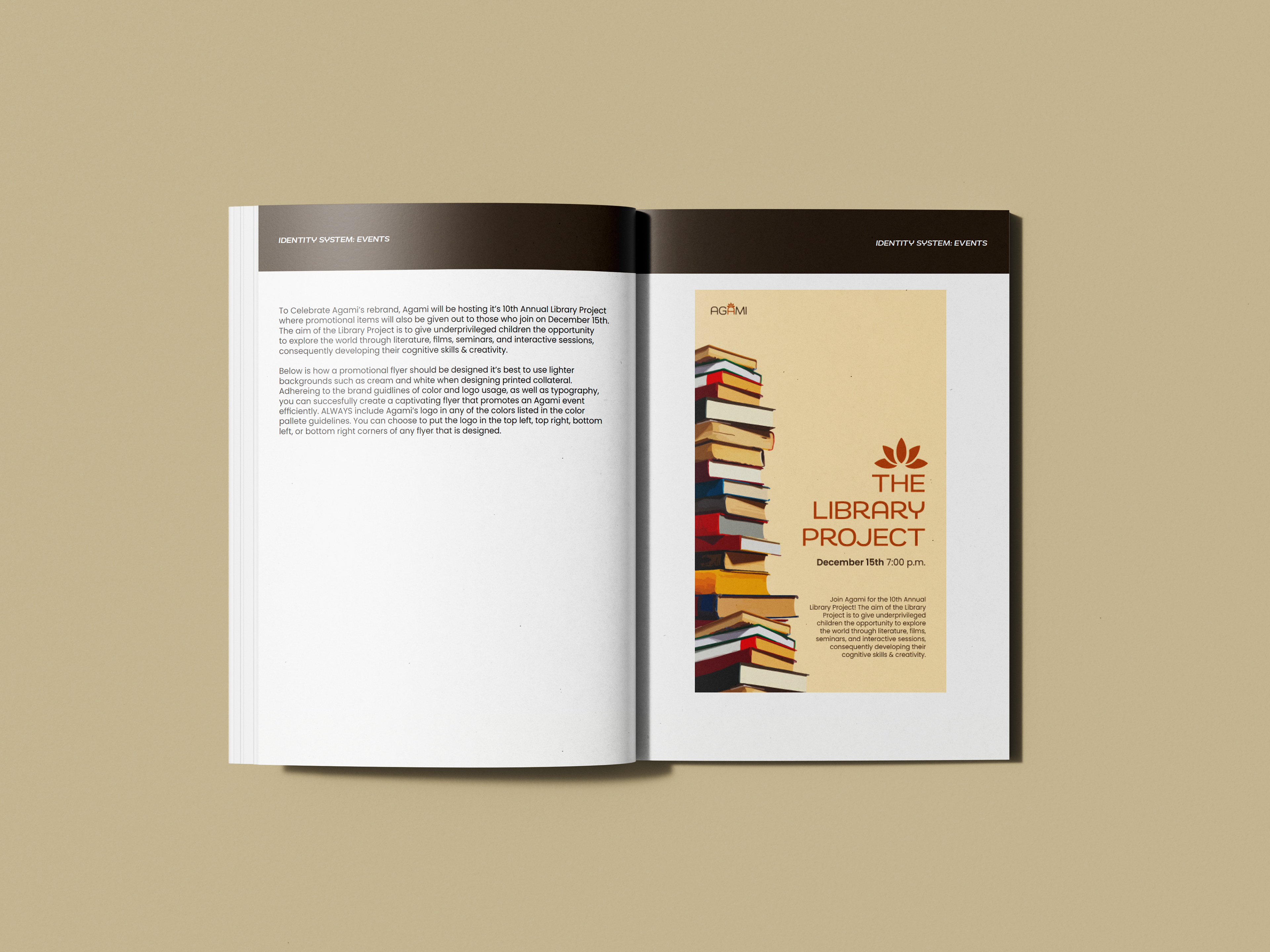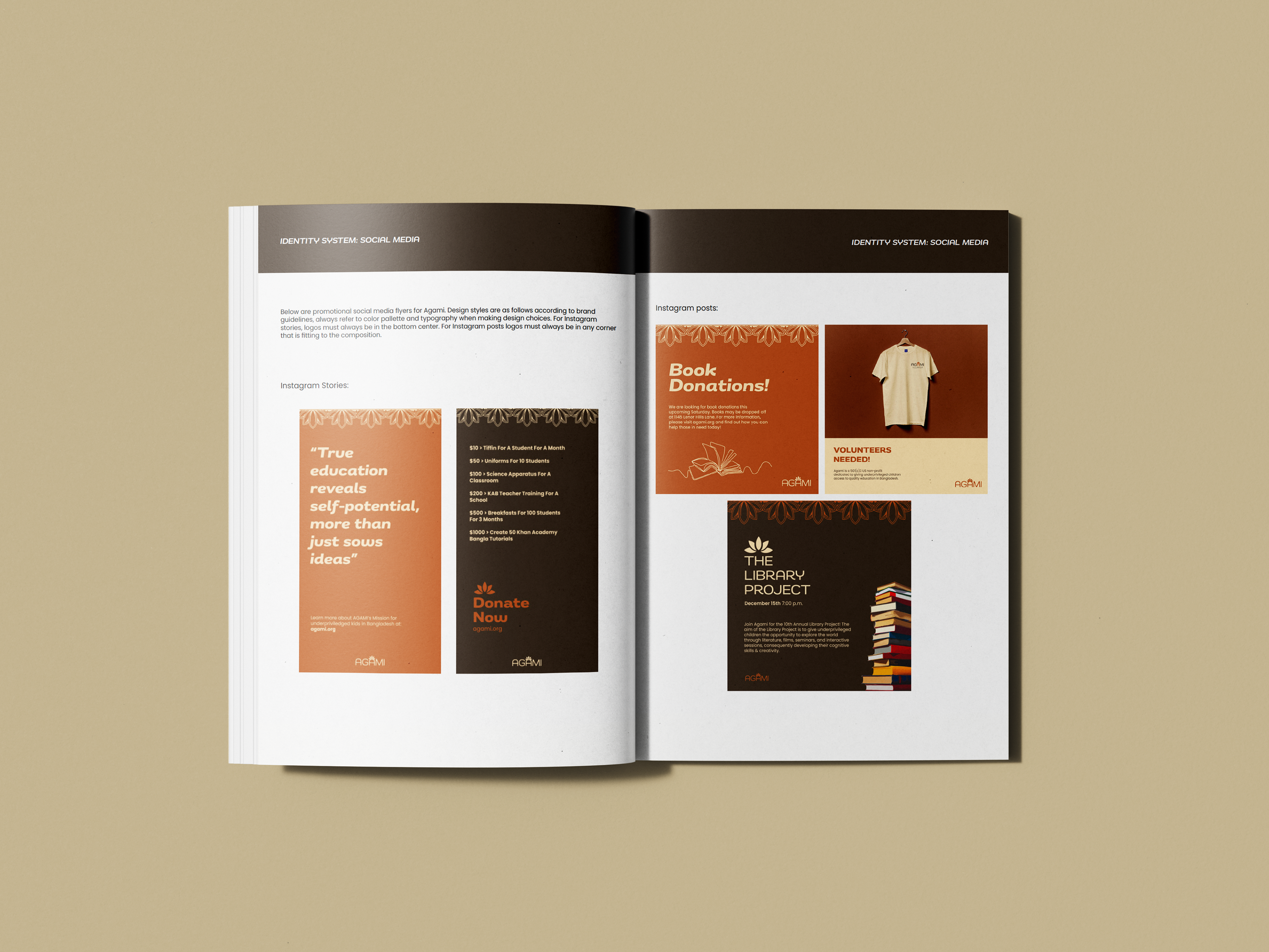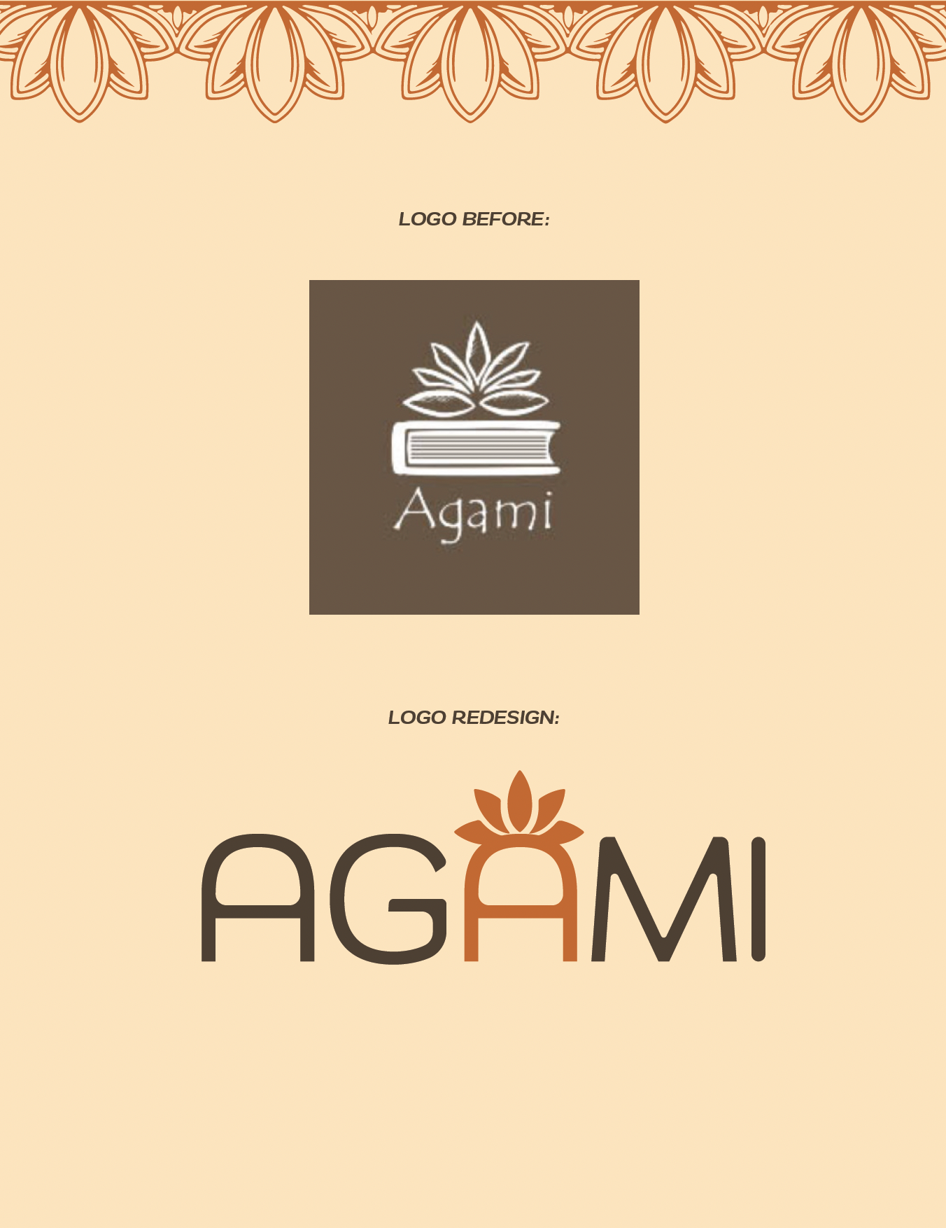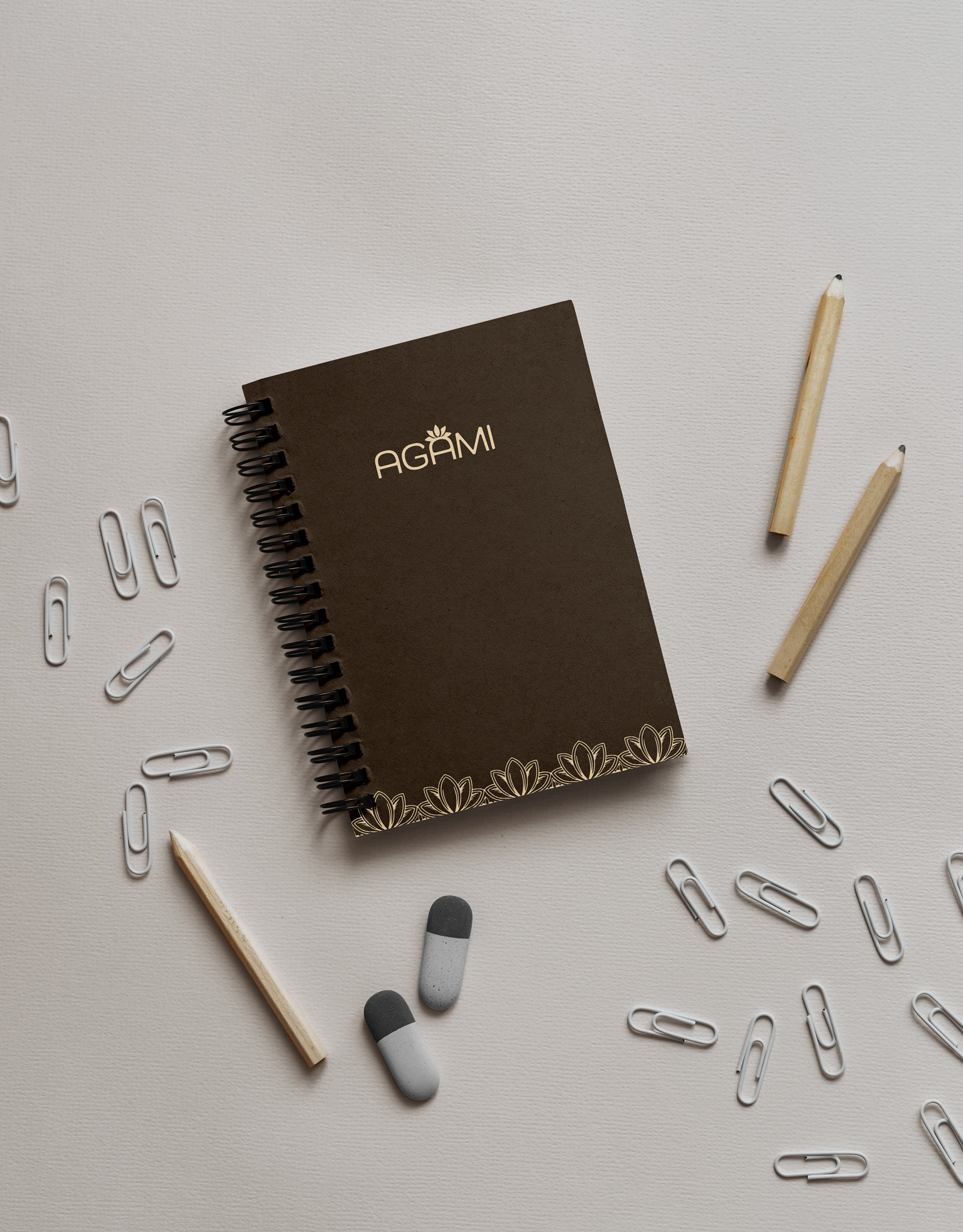


For my Typography III class we were assigned to pick a non-profit organization and re-design their logo. I chose the organization Agami, which I have personal ties to. Agami's mission is to create lasting socio-economic change in Bangladesh with education. Through their programs and partners, they create a holistic solution of basic education for underprivileged children, skills training for adults, and public health and economic initiatives for families. I wanted to design a simpler logo for this organization while still keeping some elements from the original logo such as the lotus flower, the national flower of Bangladesh. I chose a wide typeface, Remora Sans W4 and customized it to my liking by adjusting the weight of the letters, and adding more curves inside the counters and edges of the letters to add some softness to the overall design and give it an inviting feel since this is an organization dedicated to kids. I chose this wide typeface because I wanted the A in Agami to look like a chair, to elude a classroom chair. This vectorized logo was created entirely on Adobe Illustrator. Below is a brand guidelines book that shows the guidelines for this logo and how it should and shouldn't be used, color palettes, how social media and print collateral should be designed for this organization, what typefaces to use when designing anything for this organization, and promotional items.
